Tuesday, December 5, 2017

Goat

pastel on pumice board 8"x 10"
purchase

I like the intelligent look this goat is giving me. 

I've come to think that, although the handling takes some getting used to, pastels are not so different from oils. They are a little easier and faster to blend, just needing a swipe with a finger, but it's still all about values.

Time to get back to oils, as I'll be teaching a limited palette class in January. I spent the afternoon making a chart of Anders Zorn's colors, just yellow ocher, cadmium red, ivory black and white mixed to get a wide range of colors.


Tuesday, November 28, 2017

White Apple

pastel on pumice board 20"x 20"
purchase

I've been continuing to experiment with pastel. This started out loose (and I liked the looseness), but gradually settled down into something quieter and more balanced.

Never having taken a pastel class, and not knowing any pastel artists well, I feel like I need to find my own way with the medium. I ordered a set of very soft pastels by Sennelier, but found them much too soft for details. Then I ordered Nupastels, which I can sharpen to nice points using a razor. I'm very happy with using the two sets in combination.

I tried using fixitive on a section and it darkened the colors dreadfully, so I drew over that area. 

Friday, November 3, 2017

Two Shells on Blue Paper


pastel on paper 12" x 16 3/4"

Working in pastel is giving me a real jolt. It's so difficult! Yet the the feel of the soft sticks in my fingers, and the beautiful textures they give are satisfying. I thought it would be kind of like drawing in charcoal, except in color. Instead I find it hard to be very exacting, and easy to get muddy colors (on that point I'm disagreeing with my last post).  I can now see why so many pastel artists end up not blending colors, but instead placing strokes of differing colors side by side. 

This is drawn on charcoal paper, but I've been reading about preparing my own rough surfaces by mixing ground pumice into gesso and spreading it on heavyweight illustration board. Perhaps I'll enjoy a rougher, sturdier surface. Or perhaps I'll give up and go back to oils!

What really bothers me is having to leave this without a fixitive spray. How on earth to store it? It's as smudge-able as a sidewalk chalk drawing. 

Saturday, October 21, 2017

Conch Shell on Red

 pastel 12" x 13"

This is my first attempt using pastels. I've had no interest in the medium until recently, an interest that grew out of the charcoal class I've been teaching. My demonstration drawings with charcoal and white chalk had me craving the feeling of a dry medium, but in color. 

I like strict realism in color, and sometimes find that pastel paintings are too pretty. Still, I think my paintings could use some bold color, which pastel makes quite hard to not achieve. 

So much to find out- some online articles I read say that fixitive doesn't really "fix" pastel drawings- that they'll still smudge. Also that it will darken the colors. Some fixitives that I look up on DickBlick say they are glossy. I wonder what effect that would have on pastel? 

Wednesday, October 18, 2017

Self at 58

charcoal and white conte crayon 25" x 16"

I was intrigued with the idea of being quite honest about getting older. So here I am.

I used two small mirrors to get this view, and boy, was it hard to keep my face in the same position! I had to keep moving my head to check my drawing's progress from a bit of a distance. For a long time it seemed I was drawing sections of my face that didn't line up with each other. 

Thursday, October 12, 2017

Plant Study

charcoal and conte crayon 16" x 12"

First I drew all the negative (background) spaces, then the plant. In other words, all the chunks of flat white behind the leaves came first. I always tell my students that a strong awareness of negative spaces makes for stronger work. I think it helped here. 

Thursday, October 5, 2017

Large Plant in an Industrial Space

charcoal and white conte crayon  25"x 19"

I'm interested in the organic shapes of this large plant as mingled with the straight lines of my new studio space. 


Saturday, September 2, 2017

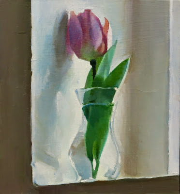
A Tulip's Shadow

oil on board 6.5"x 6"

I moved into a new studio last week, a space in an industrial building that was once a pants factory. There are about thirty other businesses here, such as a private detective and a kombucha manufacturer, a hair salon and a karate studio. I feel so at home here. The building has such strong bones yet beautiful details. 

This is my first painting completed in my new space, a single tulip on an industrial windowsill, casting an evocative shadow. 

Here's a photo of my space before I moved in. It looks to me almost like an art school classroom. 

Tuesday, August 22, 2017

Two paintings from the Village of Upper Ridge Valley

 Church Courtyard Tree  oil on paper 6"x6"

Large Pine Tree oil on paper mounted on board 6"x8"

I've spend a few hours painting on the grounds of a beautiful country church, in the tiny town of Upper Ridge Valley, Bucks County. 

Wednesday, July 19, 2017

Stacked


oil on linen mounted on board 14"x10"

Using fabric folds helps me make compositions I find interesting, even fascinating. Fabric can become so much more than itself, as in this scene where it reminds me of white smoke from a smokestack. 

Unfortunately, after a few days of posing, gravity caused the muslin fabric to droop so much that I had to stop painting it. So, lesson learned (I hope). This painting isn't really finished, but I am fond of it, so here it is. 

Wednesday, June 14, 2017

Red Box Radishes

oil on paper mounted on board 6" x 8"
purchase

Did you know that radishes shrink to half their size if left out of the refrigerator overnight? So this was a one day effort- which I very much enjoyed. Painting in one long, intense session can be very satisfying.


Monday, June 12, 2017

Jerusalem Lutheran Church Graveyard, Late Afternoon

oil on paper mounted on board 4"x 8"
My teaching schedule is over for a while, and painting outside is really getting me fired up! This is a two hour oil sketch of a local church's quiet backyard. I'm now working on a larger version.

Here is another quick study- of a garden in the rain. It was my first outside painting for more than a year, and although it was a dark scene, it broke the ice for me. 


Monday, June 5, 2017

Manhattan Rooftops

pen and ink 9"x 6"

Friday, June 2, 2017

Small Cactus

 oil on board 6"x 6"
purchase

I love rosette patterns, as seen in this small "hen and chicks" cactus plant. 

Friday, April 28, 2017

Cactus Flower

oil on board 6.5"x 6.5"

I like elucidating structure, whether it's that of buildings or vegetables, faces or flowers. This amazingly odd cactus flower gave me all the structure that I could possibly want, although it did take a while to put it all together!

World of Apples: Painting Lesson Plan #4- speed studies

In this lesson, my students took a painting surface measuring 8"x 12", and divided it into six 4"x4" squares. They painted a red delicious apples six times, only being allowed ten minutes per apple. 

They could spend some time mixing their colors before the first timer was set, using their View Catchers to judge where the most saturated reds were, and what other colors were actually there- not what they assumed they'd find. I implored them to use red's compliment (green) to de-saturate the reds. 

The top photo is of all the apples painted by all the students, while the second image is of just one student's six timed studies.


Next, everyone had to paint one apple behind another. The idea was to create a sense of distance by under-reporting the darks in the distant apple, and placing their most saturated reds on the closer one. They also slightly blurred the edges of the one in the rear.

I think they did very well with this exercise, and they seemed to find it intriguing.


Monday, April 10, 2017

Oil Painting Lesson Plans 2 & 3

For our second lesson, everyone painted white objects that had colored papers reflected on their shadow sides. The main point of the lesson was that white is almost never pure white, but is easily (and often beautifully) influenced by its surroundings.

My students sometimes have trouble with tinting white and keeping its value light, so this was a good exercise for using restraint when mixing in other hues.

Here is one student example with sensitively observed whites:


The third lesson was focused on painting glass. Each set up included two glass objects, one with nothing but white paper behind it and the other with colored paper and a mango. Everyone had to paint the simpler one first, then tackle the one with the mango.

The idea is that when you paint glass, you aren't really painting the glass. Instead you are painting what you see behind it. If a glass has nothing behind it, it likely is just ever-so-slightly darker in value than the background. You begin by simply filling in the entire shape with this color/value. Some under-reported edges (just the ones you see when you squint) and a couple of selective highlights can complete the feeling of glass.

For the other glass object, the lowered intensity of the colors of the mango and colored paper as well as the distortions as seen through the glass give the vase its transparency.

A student example:


Friday, April 7, 2017

Mango on Box

oil on board 5"x7"

A very simple two day painting. Simple can be hard- there isn't a lot to hold on to. 

Tuesday, April 4, 2017

Three Small Landscapes


Peaks Island Road 
oil on paper mounted on board   5 5/8" x 7"

 Carbon County Tree Farm 
oil on paper mounted on board  6" x 6 5/8"
purchase

Perkasie View
oil on paper mounted on board 5" 1/2 x 7"
purchase

Sunday, March 26, 2017

Oil Painting Lesson Plan #1

Today was the first day of my spring oil painting class for people who have some painting experience. I find teaching to be lots of work (of course!), but very stimulating and fulfilling. 

I've decided to create a post for each of the eight sessions, in hope that some people might find useful information for their own teaching, or for their own use.  

This first lesson involved working with only five values. Orange and blue were mixed to create a neutral and dark color, then this color was mixed with white to make three more values. White was the fifth value. A value for a specific area was chosen by peering through a pinhole, and the value was laid down with no blending- as though it were part of a mosaic. At the very end of the class just a little blending was allowed, but only after viewing the painting from a distance and choosing just a an area or two where it could be helpful.

The goal was to see the big shadow shapes, and to be forced to make continuous comparisons of values across the whole composition. When you only have five piles of paint to work with, you are forced to think in very broad terms. You are forced to simplify. It's a good way to begin a painting, no matter how much detail you might want to add later. 

Here is my example of this approach, followed by some great work by my students:


Saturday, March 18, 2017

Tousled Tulips


watercolor and pencil 8"x10"


I've been staring so hard at these four tulips and their swirling surroundings that I'm not able to tell if my painting works or not. I sure did a lot of scrubbing out and repainting, making me wonder why I wasn't using oil paints! Aren't watercolors supposed to be a more spontaneous medium? I'm glad the thick paper took the scrubbing. Perhaps the close up of three tulips is more successful than the whole painting? Will I continue with watercolors or turn back to oils? Questions, questions! 

I do know that I tend to work in cycles; I don't like jumping from one medium to another. 

Wednesday, March 8, 2017

Oil Painting Lesson Idea

I want to share a lesson I taught my beginning oil painting students last month, as they seemed to find it especially helpful as well as intriguing and fun. 

Their job was to take a color photograph and turn it into a monochromatic painting. Only a pair of compliments and white were allowed on the palette. Everyone had to premix the compliments to make one big pile, which was fairly dark. Then they made two more piles from this big pile by adding white in larger and smaller amounts. They ended up with just four piles of paint to work with- a dark color, two in-between values and white. The complex photograph with dozens of perceived values then had to be interpreted as having only four. Lots of decision making, less imitation. 

Here is the photo my students worked from, along with four results. 


Below is a beautiful photo of Switzerland taken by my niece Sarah. I felt inspired to try the four value technique, but I went overboard and ended up cheating. I used way more than four values! But I did begin with just four, which helped me get a strong initial statement.


Bethlehem, PA

watercolor and pencil 9"x15"
I haven't been painting, as I've been way too busy lately. For one thing, I moved a month ago to a gorgeous loft-style apartment in a wooded area. I've been teaching drawing and painting classes, plus working two other part time jobs- but now I'm starting to feel settled and eager to get back to it. 

While organizing my new studio situation, I came across this watercolor of Bethlehem, PA that I'd thought was not good enough to post, but now I think it's okay. Funny how stepping back can make an improvement in outlook!