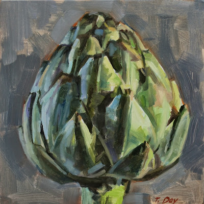
The structure of an artichoke is such a pleasure to look at, and to paint. The green leaves in different lighting can look blue, purple, or lime green, and the tips have that lovely bit of orange. Best of all, when one stands upright, it seems to be emblematic of a pride and inner strength. At least for me.
My new Mac desktop monitor show this image as having both strong color and contrast, while the same image on my old Dell monitor looks dull and washed out. Instead of fixing the image so it looks right on the Dell, I'm sticking with what looks good on the Mac. Anyone have any advice?
oil on board 6.5"x 6"
This boy was bounding down the steps of the Philadelphia Art Museum, only to run right back up to the top and do it all over again. And again. I love backlighting, and was interested in all the diagonals in this scene. Oh, and like most of us, I love watching kids run around.
After thinking about it for ages, I finally got myself an iMac. I'm completely amazed and happy with the difference in quality of visual images compared with my old Dell monitor (nothing against Dell, because it's lovely to be able order a decent desktop for less than $300).
Whereas before I'd be straining my eyes to determine if a subtle color was warm or cool, now it's so easy to see. With iPhoto, I can lighten shadows without lightening the lights. The sense of depth is amazing, and the light from my studio windows doesn't interfere much.
I'll be paying it off for 18 months, but it's entirely worth it (for any of you artists out there).

