Sunday, May 4, 2014

Painting Planning

It's been a wrenching process to get away from the Daily Painting mindset. I often hear a nagging voice in my head asking when I'm going to post something on this blog, but right now I want to paint the best I know how, and I don't think my best work is stuff I complete in a couple days.

I'm going to show you a couple of my older paintings of interiors with still life that I'm using as guides for my current work, although I don't want to replicate the style too closely. These two images are digital files from old slides:

Studio Interior oil on canvas 

Studio Table and Plant oil on canvas

I've been doing a lot of drawing, trying to work out ideas for longer-term paintings.  I'm in the midst of a painting now that I'm excited about, but I've had a few false starts. 

Another thing- I'm chucking my camera for a while. From the working drawing to the painting's end, I'm not relying on any photographs. Not that that's a terrible thing, but I believe working from life gives a painting a more personal feeling. 

Here are some current drawings/ideas for paintings:


 Thanks for looking!

Saturday, March 29, 2014

A Couple Blowfish Drawings

  Blowfish in my Studio 12"x9" graphite

That Blowfish Again 9"x12" graphite

Here are two drawings of a little studio presence, a blowfish I got in Florida years ago. The first one I completed in about 3 or 4 hours, but the second one took about twice that long. 

I recently started an evening job, which has been helping me to feel more free in my work. I've been drawing just for fun lately, not caring so much whether what I'm doing will result in a sale or not (which is a quick way to kill your creativity). I'm not even sure if I should post these as for sale or not!

Monday, March 24, 2014

Halved Acorn Squash

oil on masonite 8"x6"

Whew.  At last I'm coming out of a major block against working from life, which started several months ago. I'm not sure if it's because I was getting too used to the convenience of working from images, or the increased possibilities of interesting subject matter, but I sure have been having trouble setting up a still life and feeling like I care.

I love painting vegetables, fruit and flowers, fish and seashells and other typical still life subjects, but I realize that in order to feel strongly enough about these small things to paint from them, I need to really push unusual viewpoints and dynamic lighting- whatever it takes for me to feel like they have something to say. Notice I wrote "they", not "I", because I honestly feel like this beautiful acorn squash is the one talking here. 

I find the great photographer Edward Weston's images of vegetables to be especially inspiring. Here are some of his sensual interpretations of common vegetables:

 Cabbage Leaf 1931

 Pepper 1930

White Radishes 1933

Friday, March 21, 2014

Dream Cityscape

graphite on paper 10"x10"

This is part of an unknown city with a major thoroughfare snaking its way to a graceful bridge over an unknown river. I wanted it to seem dream-like. 

Every time I begin a graphite drawing I feel vaguely guilty, because most people want to see paintings. I've had this itch, though, to continue my theme of aerial views of various cities, and I can best express what I want to say in graphite.

There is something about a view from a great height that really captures my imagination. Looking down with a birdlike- or even godlike- view of a complex city seems to me to be like being able to contemplate the course your life has taken with sudden clarity. When I draw these kinds of scenes, lines from Jane Hirshfield's poem It Was Like This: You Were Happy always come to my mind. Here the speaker has at last been able to look clearly, but without regret, over her life:

Now it is almost over.

Like a lover, your life bends down and kisses your life.

It does this not in forgiveness—
between you, there is nothing to forgive-
but with the simple nod of a baker at the moment 

he sees the bread is finished with transformation.
Meanwhile, my Mom's been encouraging me to paint the more cheerful subject of flowers, so I'm off to the market to have a look.

Thursday, March 6, 2014

Manhattan Water Towers

graphite on paper 5.5"x12"
click here to bid or purchase

I've become bored with still life, but I remember the days when I'd spend three or four hours arranging fruit and folds of cloth until I was satisfied with a composition. These days I much prefer to look for satisfying arrangements of things that has happened naturally, or if constructed, without much aesthetic consideration.


Monday, February 10, 2014

What the Cat Knows

oil on board  6x6 inches

I know it's always being said, but cats sure seem to know something that we don't.

Thanks to Inge Dagmar Manders for allowing me to paint from her photo of her beautiful Charlie perched on a fence.

Saturday, January 18, 2014

View from Bridgeport PA

graphite on heavyweight paper 9.5"x 21"

I spent a full week on this drawing, and my process was the usual back-and-forth of adding detail upon detail, then erasing and blending to get rid of too much clarity. Too much clarity doesn't give a feeling of atmosphere, and atmosphere = poetic. Sounds a little silly but true.

I know this scene might be thought of as kind of ugly by some, but with the right lighting it becomes gorgeous. Also as usual, the backlight of early morning was the way to go. 

Tuesday, January 14, 2014

Three Freesia and Re-learning Patience

oil on board 12"x 8"

This is a painting from a very long time ago, when I used to have patience. I've become so accustomed to following the guidelines of the "Daily Painting Movement" that it's become difficult for me to slow down and give my work the kind of time that it needs. 

My intentions are to move away from my four + year habit of finishing a painting in 1-2 days. This isn't really a decision that I felt free to make: I honestly don't think I can continue to work that way anymore without becoming quite unhappy. Now and then I'll work quickly, but most likely it'll be a way to work out an idea for a larger painting.

There isn't anything wrong with "Daily Painting", and there are many painters out there who work that way with awesome results. It's just that I think MY work is better when I slow down. I'm also a naval-gazer by nature, so slowing down and really stewing over a painting is a better fit for me. 

Thanks for reading this! I'd love to hear what you think. Here's another older painting, one that I spent more than a month on:

Mirrored Still Life with Shell oil on linen 24"x 30" 


Sunday, November 3, 2013

Buildings in Saint-Sauveur, Quebec City

graphite on paper 10"x10"

I love this sweeping view of the neighborhood of Saint-Sauveur, Quebec City, especially the long ribbon-like shape of the street that stretches into the blurred distance. 

Perhaps like most of us, when I was a child I had a recurring dream of flying. In those dreams I felt an intoxicating mix of freedom and excitement, and I try and recapture some of that feeling in these aerial views. 

Wednesday, October 23, 2013

Almost to the Castle


click here to bid

I photographed this charming girl at the Philadelphia Museum of Art. She was with several adults who were closely attending a tour in Spanish. The tour guide spent at least a half hour in each room, and the little girl kept gesturing and whispering to herself, wrapped up in an imaginary world.

She reminded me of my own daughter Julia's childhood, when she would often talk to herself while acting out some story in her mind. Once my brother-in-law, in observing Julia in the thick of her private play-acting, said "she's almost to the castle". That is such a wonderful way to put it!

I think my paintings have been getting a tad bit uptight lately, which is always painful, and I've been feeling a little blocked. Thankfully this little painting seemed to float out of me.


Tuesday, October 15, 2013

Tips and Tricks Carnival

Artist's Tips and Tricks- a Blog Carnival!

Today a group of six painters are blogging about some of the tips and tricks of our trade. I'm putting a special emphasis on my approach to painting from digital images.

You can click on these other five artists to gather more helpful tips:


I've been painting from life for more than thirty years, but in the last two years have developed a method for painting from my own digital images that doesn't scream "this was painted from a photograph!" 

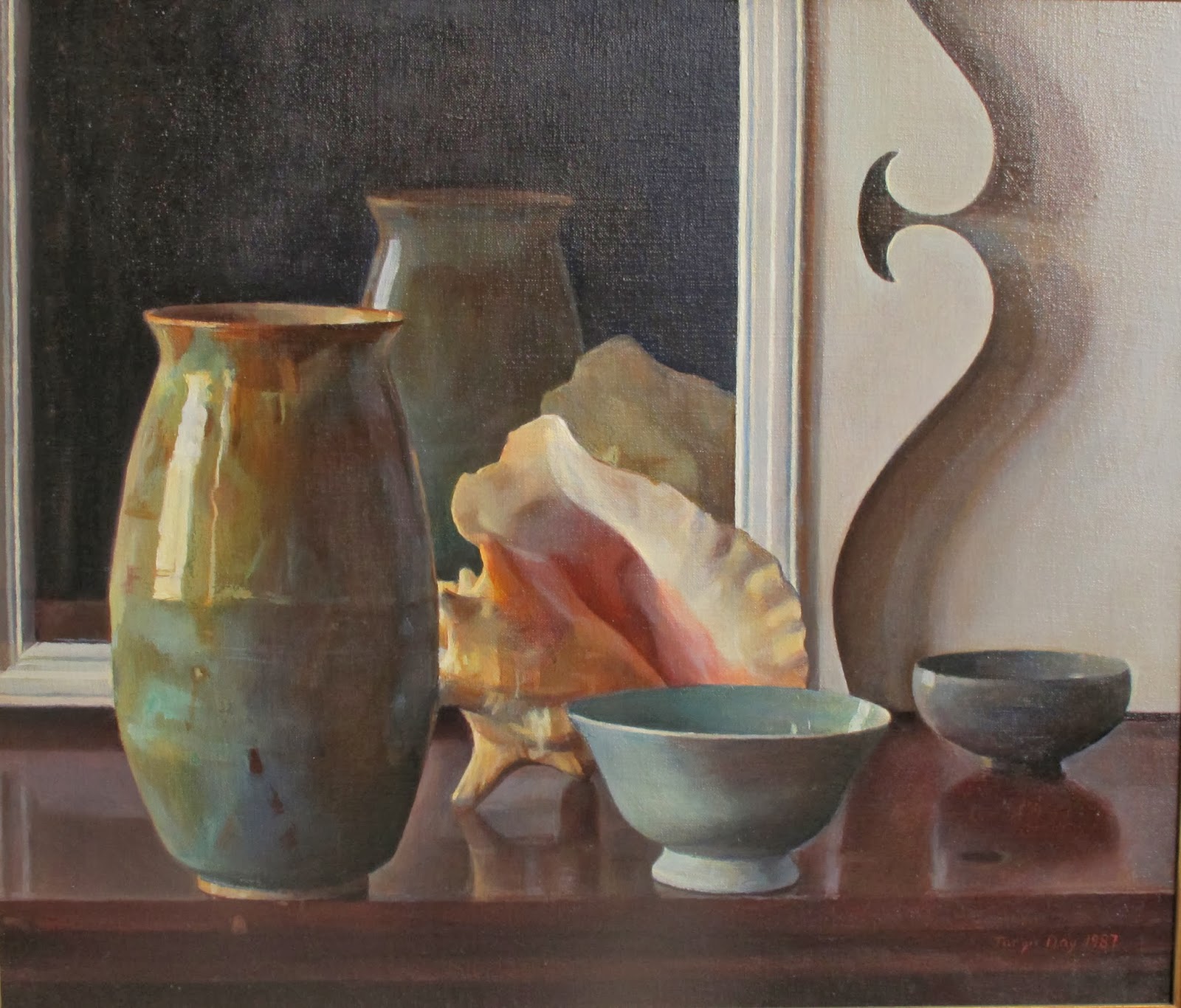
I enjoy working from photographs because the practice has opened up subject matter possibilities to an amazing degree. Many people ask me if I work from life or not, even when I paint a pose that would be impossible for someone to hold, like this:


A photograph or digital image gives too much information, and at the same time, not enough. There is too much information about detail, with edges gaining an importance they don't have in real life. There is not enough information about color, and the shadows are too dark, and the lights too light. 

The temptation is to paint with a tiny brush, trying desperately to capture everything seen in the photo, but you have to use some smarts or the photograph will conquer you.

Here are six of my main "tips and tricks" for working from a digital image:
1. Choose an image that has strong value contrast. Using your computer's photo editing program, view the image in black & white. If the image is still compelling, it will work well in color. 


2. Print out the image in black and white. With the use of a grid, draw the composition on your panel upside down (more on that in a minute). Keep this print out next to your panel or canvas while you paint, and constantly check it for the correct values. Getting the correct values trumps getting the right color. 


3. Paint from your computer monitor, and always with the image upside down. That's the best way to forget the subject, and to trick your mind into putting less importance on concrete information like "this child has a nice smile", and more on pure shape, line and color. It's the best way to keep your focus on the abstract qualities of a subject, which will help your painting look less stiff and photographic. 
Every now and then you can turn your painting over to get a very fresh look at your progress. I set my painting on a shelf in another area of my studio, and always view it from several feet back. If it doesn't look good from a distance, it won't be a strong painting. 
4. When you work in a shadowed area, use your photo-editing program to temporarily lighten it. Having deep shadows with little infomation will make your painting look overly photographic. Darken your image when working on the most strongly lit areas. Backlighting is beautiful, but you have to continually adjust the brightness to make it work. 
5. Use a variety of brush sizes, using the smaller ones for an area you want to focus on, and larger ones for summing up an area. If part of the scene is overwhelming in detail,   move ten feet back from the computer to work on it, and try squinting. Getting way back is the best way to see the scene as a whole, and will help your work to not look overly tight.
Utrecht's series 239 mixed synthetic Brights are great for details and Princeton Brush Series 6300B work well for working more loosely.


6. If you wear glasses, now and then take them off while you paint. If an area is giving you trouble, especially if it is a face, paint it upside down and without your glasses and you'll be amazed at how much easier it is to get a likeness. 
So there you have it, six quick tips that I've spent years figuring out. Hope it was helpful! If you'd like more detailed information about my approach to working from digital images, you can visit my ArtByte shop.

You can click on these other five artists to gather more helpful painting-related tips:


Tuesday, September 24, 2013

Artichoke

The structure of an artichoke is such a pleasure to look at, and to paint. The green leaves in different lighting can look blue, purple, or lime green, and the tips have that lovely bit of orange. Best of all, when one stands upright, it seems to be emblematic of a pride and inner strength. At least for me. 
My new Mac desktop monitor show this image as having both strong color and contrast, while the same image on my old Dell monitor looks dull and washed out. Instead of fixing the image so it looks right on the Dell, I'm sticking with what looks good on the Mac. Anyone have any advice?

Tuesday, September 10, 2013

Boy in Stripes, Art Museum Steps

oil on board 6.5"x 6"
This boy was bounding down the steps of the Philadelphia Art Museum, only to run right back up to the top and do it all over again. And again. I love backlighting, and was interested in all the diagonals in this scene. Oh, and like most of us, I love watching kids run around.
After thinking about it for ages, I finally got myself an iMac. I'm completely amazed and happy with the difference in quality of visual images compared with my old Dell monitor (nothing against Dell, because it's lovely to be able order a decent desktop for less than $300).
Whereas before I'd be straining my eyes to determine if a subtle color was warm or cool, now it's so easy to see. With iPhoto, I can lighten shadows without lightening the lights. The sense of depth is amazing, and the light from my studio windows doesn't interfere much.
I'll be paying it off for 18 months, but it's entirely worth it (for any of you artists out there). 

Tuesday, August 27, 2013

Quebecois Cows

oil on board 5.5"x 8"

Two of these beautiful cows were curious about me, while two were decidedly not, which leads me to wonder about the nature of the curious ones. Are they more intelligent than the other two, or just less hungry? Or maybe cows take turns with inquisitiveness, with only a few of them on duty at a time.


Friday, August 23, 2013

View of Saint-Sauveur, Quebec City

graphite 7.75" x12"

Quebec City wouldn't be half as beautiful if it weren't for the division between the "Upper Town" and "Lower Town". Here's a panoramic view of the Lower Town neighborhood of Saint-Sauveur, with its church of the same name seemingly afloat in the gorgeous busyness of homes, office buildings, and summer trees.

Saturday, July 27, 2013

Old Quebec Rooftop Scene with the Hotel Frontenac

Graphite 4 3/8" x 9 3/4"

At last I've included the famous Hotel Frontenac in a drawing, even if just one section, or slice of it. If I haven't come up with a composition that excites me. I have so much trouble with motivation. I like unexpected views and surprising croppings, and coming up with the right mix can take me a long, long time.

When I first arrived in Quebec, I was obsessed with this famous hotel, thinking that OF COURSE it would have to be the first thing I drew or painted. Now, with the help of a friend's insight, I realize that when a subject is too well known it can be the most difficult subject. Finding something new to say about a tourist attraction- and all of old Quebec is a tourist attraction- it is quite a challenge.

Here is a more typical view of the famous hotel, partly under renovation:


Wednesday, July 24, 2013

Quebec City Layers

Graphite 4.25"x10"

I like this Quebec City scene for its combination of many very different kinds of structures. There are the gracefully peak-roofed and historic public buildings in front, the newer glass-walled office buildings, and in the back at least two separate industrial sites, churning out smoke. I love the busyness and the cacophony of this layered mix, bound together by the distant mountains and the late afternoon light.

Friday, July 19, 2013

Basse-Ville, Quebec and the Saint Lawrence, Morning

Graphite 9.5"x 8"

Another view of the oldest section of Quebec, Basse-Ville. Samuel de Champlain founded the first permanent settlement here in 1608.

I'm having a fantastic time drawing this wonderful city in pencil. Sometimes I simply crave getting the details down, which I can't do in a quick oil study.


Wednesday, July 17, 2013

Looking Towards Saint-Roch, Quebec City, Late Afternoon

graphite 4"x 10"

I love the complexity of cityscapes. Here is a view of a trendy Quebec neighborhood called Saint-Roch, and far beyond. I always think a cityscape looks best with at least one church steeple.


Thursday, July 11, 2013

Nestled Buildings in Basse-Ville, Quebec

Graphite 7.25"x7.25"

I'm simply mesmerized by the buildings in Vieux Quebec, especially the ones in the oldest section of Basse-Ville. Each one is so old yet so beautifully maintained, but it's the way they are nestled together that really grabs me. By the way, my father was an urban planner, and loved visiting this city.
I know, I know, I need to start painting, but I love drawing too. Not at first- at first it's all measuring proportions and checking angles, and seems so challenging. About 3/4 of the way through a drawing can kind of take off, and then I'm just hanging on for the ride.